This year we have completed a variety of websites for clients that I want to share with you. Ever since I started collaborating with Jackie D’Elia it’s been increasingly impossible to design/construct websites without incorporating some SVG animation. Once you start to incorporate them into your sites, you can’t imagine creating a site without them. They add a lot of pure goodness when handled well.
Use SVG graphics & SVG animation for logos, navigation icons, social media icons, background imagery, story telling, graphic appeal, and to stand out from the competition. Once you start using them – there is no turning back!
First you may know that SVG (Scalable Vector Graphics) files are light-weight and load fast. (unless they have a large amount of paths) They can speed up a site’s load performance significantly. Also, they are vector files – not bitmap/raster images that rely on pixels. They display beautifully at any scale and that means they look beautiful on retina screens too. So, no need for web fonts, .jpg’s, or 2x .png files etc etc…. they are actually code! We optimize them using some awesome tools that Jackie can introduce you to. I’m just going to focus on design and good use cases here today with some recent examples.
I typically build the files in illustrator and sometimes we purchase stock files too and I modify them and customize them on a per project basis. Conceptualizing is the first step once we have the visual language, styles, and messaging outlined for a client.
There Are Lots of Creative Ways to Make Use of SVG Graphics, SVG Animation, and Human Interactions
Logos & navigation & social icons are among the most fundamental ways to integrate SVG graphics when starting out. Logos should always be the first file to consider. See here on my site the logo in the header is an SVG file. It’s fast, sharp and looks great on all screens all of the time. Awesome! Here on my site, there are no animation effects but you could have them if it makes sense. Those might include, but are not limited to a change on hover – like a size change, color change, or even a more dynamic sequence of effects. The logo may be presented differently on mobile and on desktops as well. Cool right? Next up I take an inventory of the main navigation, content cards, or other content components we may be designing with, plus we look at the over-all content organization to see where we can implement some icons for clarifying and improving the presentation & delivery of quality content to site users.
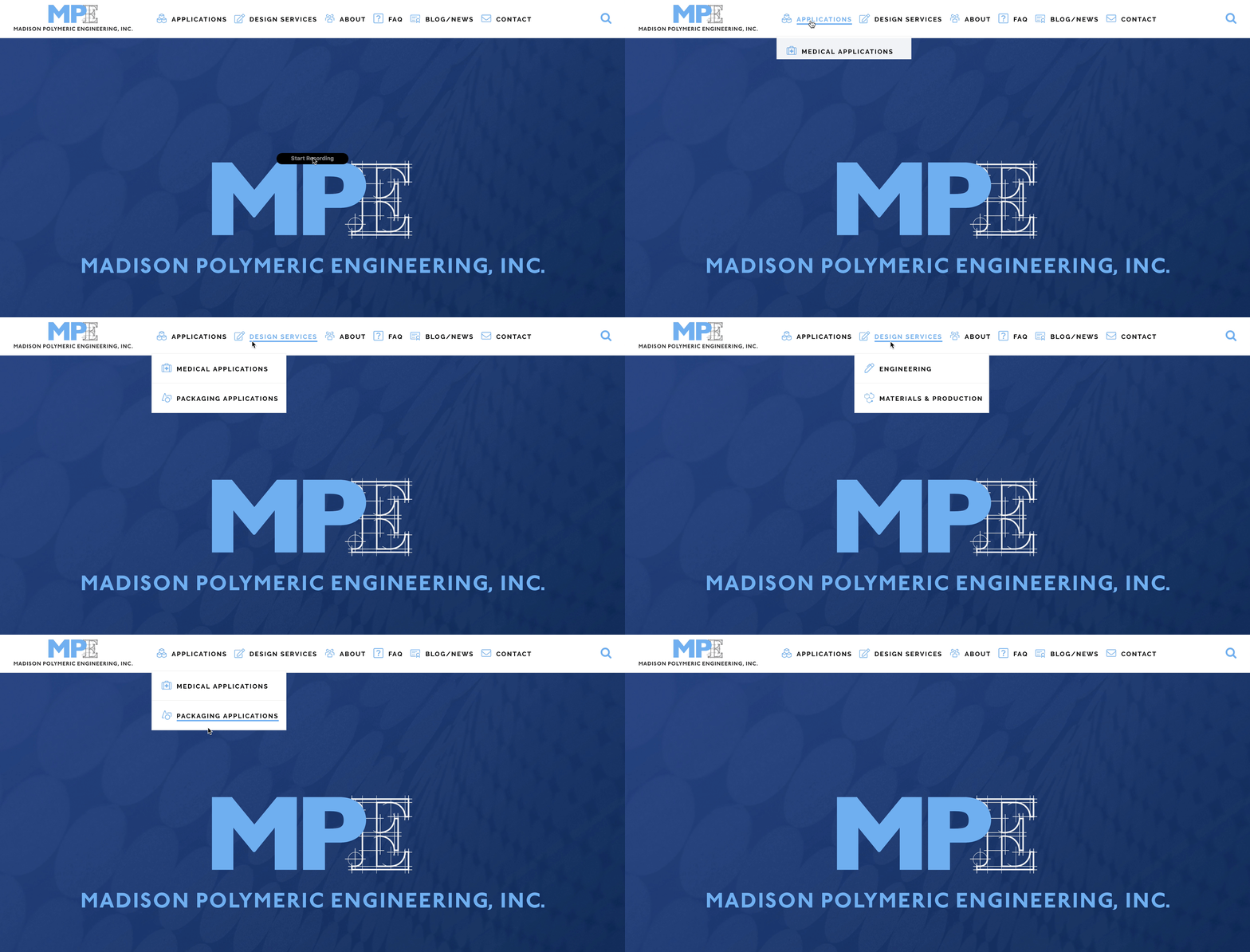
See the navigation icons in this example below: Madison Polymeric Engineering
In this case I included outlined or “stroke” icons rather than fill shapes. It’s modern and clean and fits the visual presentation of the detailed engineering work that this company does. Providing this extra layer of detail demonstrates to potential customers that MPE values attention to detail and says visually “We care about our customer’s experience”. An outdated website that has not been maintained, updated, or cared for makes companies seem untrustworthy often.
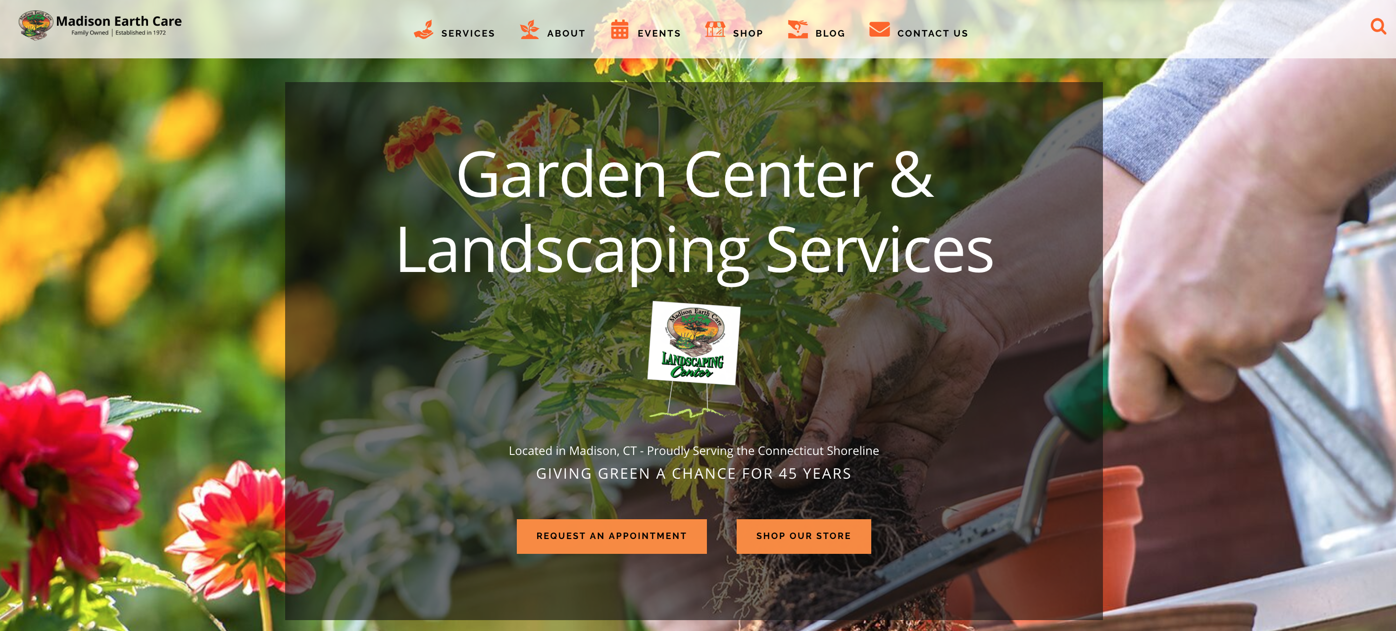
I also really love fill style icons… Madison Earth Care
Remember you can add fun animation effects too… transformations that happen on scroll, load, hover etc etc. A color change, size, movement, morph etc… I’ll just show you a few examples. I’m learning and I do the art direction while Jackie does the coding. Together though we get a synergistic set of creative options and solutions and that is what makes the work so exciting.
In this industry there is so much to learn because it is all changing and expanding in a million different ways a l l o f t h e t i m e.
It is a luxury to collaborate. Let us know if you want to subcontract animation work to us. We will support you and and help you deliver something special to your clients.
Use SVG Animation Effects That Are Triggered by User Interactions
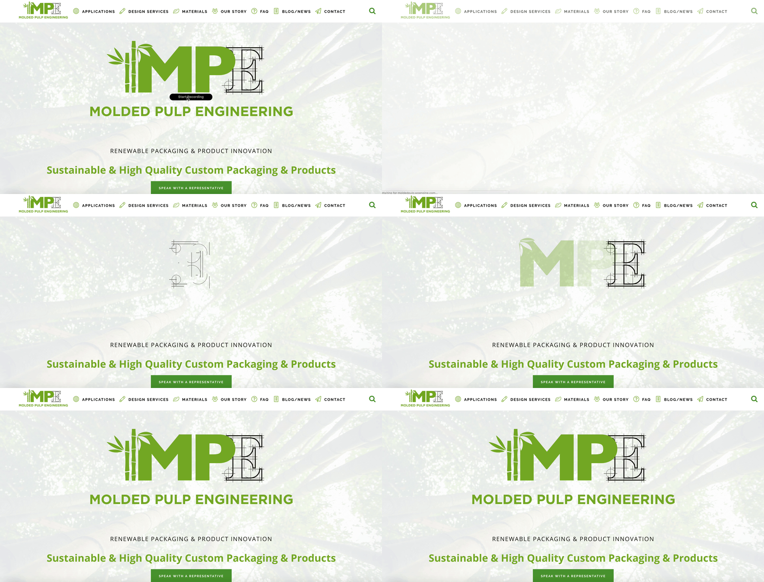
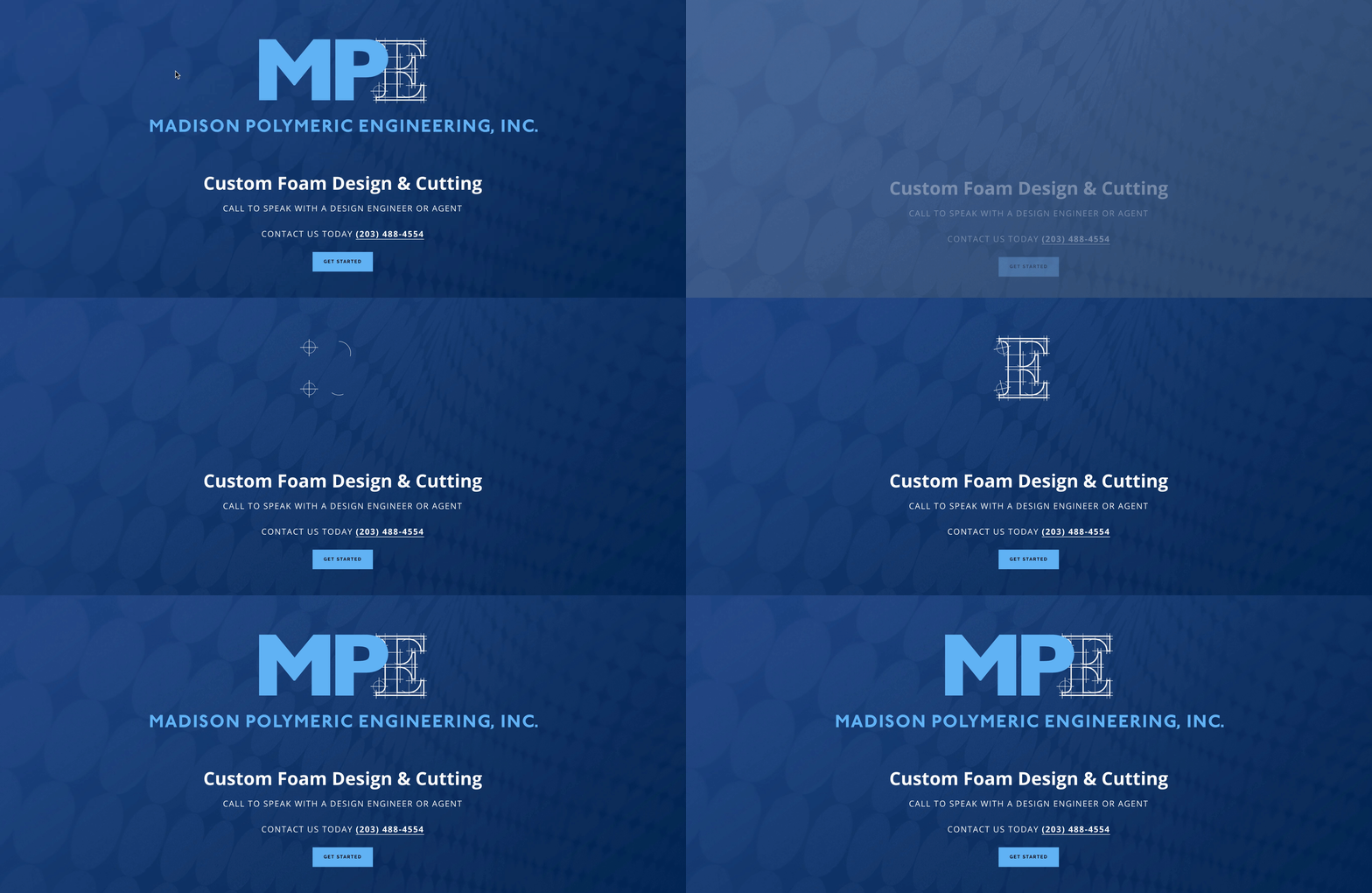
In this next few of examples you will see how we took the hero section of the home page and created some animations that start on page load. They only run through 1 time on the live sites. In the first two examples – the logos appear to draw themselves… really cool for an engineering companies. Madison Polymeric Engineering is also phasing in a totally GREEN version of their packaging and medial products & services. Molded Pulp Engineering Madison Polymeric Engineering
The live sites present smoother than these screencast GIFs….
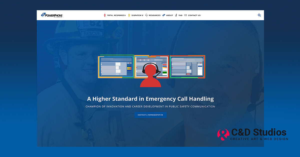
Next is an example of an animation that runs continuously in the hero section of the home page. Their logo and navigation icons are custom from their own identity branding, their product, and business or service verticals. This is an amazing company that provides emergency dispatch response software and also provides training and certifications for teams nationally and I believe internationally too. They create state of the art products and their site tells that story visually now too. The strong CTA (call to action) structure of their site will serve them well moving forward. Their animation tells the story visually. PowerPhone
Here is another example of using an SVG animation to tell the story visually about a business… It’s fun and creative – like PowerPhone’s dynamic animation – this one also runs continuously. Madison Earth Care (On the live site scroll down to the footer on this site for some more creative but static SVG graphics) One of the biggest challenges of this site was overcoming a very outdated (lovely work, but not a good application for a logo) landscape watercolor painting that the family has been using as a logo mark for 45 years. This is a local, family run company that is very well known and highly recognizable – imagine trucks, signs, jackets, hats, tractors, – logos on all kinds of equipment etc…. they can’t change their logo easily and so we did some creative work to integrate it. They are still working on learning how to really maximize their web presence. Now they stand out from the competition though! 🙂 They are primarily a landscape, stonework, and lawn maintenance company with a new emphasis on their retail garden center.


Here are some example of SVG icons animated on scroll for an enterprise project. We animated hundreds of icons I think…. They are really fun on scroll – nice rewards for interactivity. If feels like you are drawing them as you scroll. This was completed some time ago and last I looked the site had them off .. but this demo helps. See also a subtle divider animation that activates on scroll.


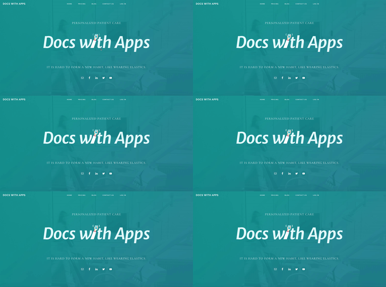
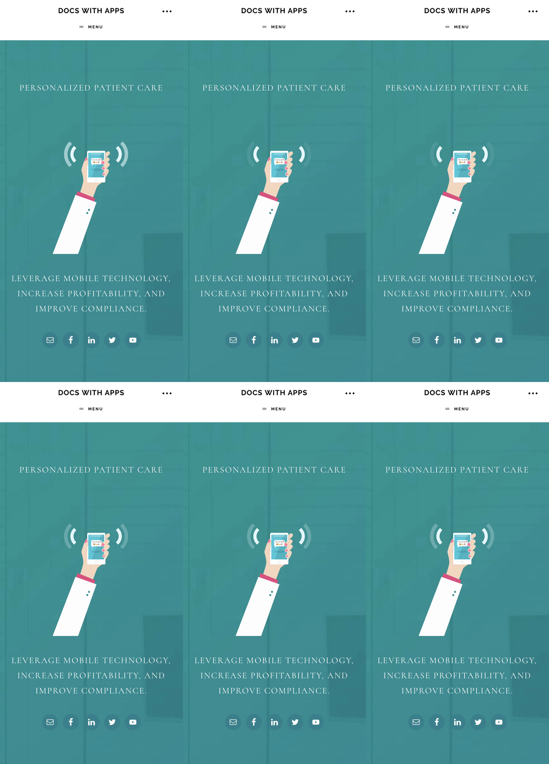
Lastly – I am going to show you our site that has an animated “word mark” in the hero section of the site – it pulls up a different animation on mobile. This is also something important to consider when designing the website. Mobile first!! 🙂
Docs With Apps provides mobile apps to the medical industry – primarily orthodontists so that practices can send fun mobile push notifications to their patients phones reminding them to wear, change and replace their elastics.
We also have a repeating SVG animation in a lower section of the website that features some of the hilarious emoji rich content that is part of the compliance reminder program for kids.
Check out Docs With Apps

I know these GIF examples are a little bit challenging but I hope it begins to illustrate some of the creative possibilities, important considerations, and how much FUN animations are to design. I’m sure Jackie will share some technical details if you want to learn how to code your own, but if you need support delivering this kind of quality to your clients please let us know and we will get you a quote. We are here to help fill the gap for other agencies and design/developers.
Remember, less is often more – you do not want your sites to turn into stressful experiences for users – you do want them to be satisfying and engaging experiences!
If you need a quality custom website, please contact me.
Use SVG animation – graphics & animations for logos, navigation icons, social media icons, background imagery, story telling, graphic appeal, and to stand out from the competition. Once you start using them – there is no turning back!
